Colour grading setting emotions with colour
This is a big topic and seriously 700 words is not enough to do this blog
First, you need to understand colour and how it makes things pop and highlight things.
Then you need to understand hue, saturation & Chroma, and brightness & lightness, opacity clarity.
Then you need to know how LUT tables work they are called lookup tables depending on what film you are using each supplier has its own custom specific LUT tables for the film you are using.
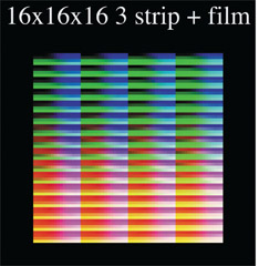
Before LUTs LUTs Tables Added After LUTs
Then you have Additive and Subtractive Colour systems RGB for the Additive and CMY for the Subtractive colour system.
Additive colour system
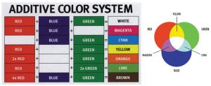
Image courtesy of American Cinematographer
States” adding these three primary colours together in various combinations builds every other colour up from black, and this is known as the additive colour process
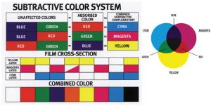
Sbtractive colour system
Image courtesy of American Cinematographer
States “we learned in art class that red, blue, and yellow are primary colours (and that we aren’t supposed to eat paint). But those primaries apply to dyes and pigments, and they actually are called subtractive primaries
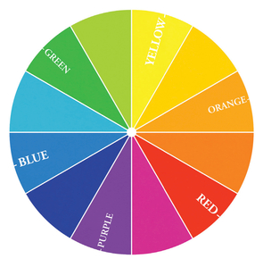
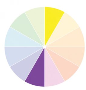
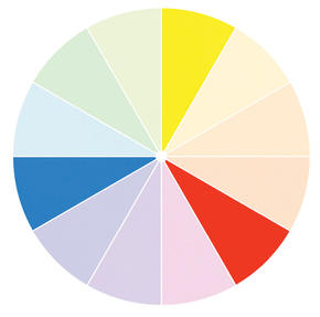
Colour Wheels help with working our what colours go with what.
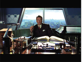
As you can see above red pops out from all colours this is why a red carpet at a premiere is red because everything in the background stands out for e.g.
Using colour to evoke emotions
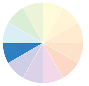
Using monochromatic
Monochromatic color schemes are quite common in short form filmic work, this mode help things pop
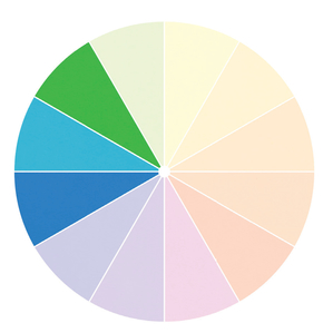
Analogous colour scheme
This sort of color scheme has a casual, natural feel, and doesn’t demand all that much from the viewer. The analogous color scheme is a good, safe choice much of the time,
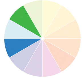
Diad colour scheme
This sort of scheme keeps some of the naturalism and casualness of the analogous color scheme, but by removing one of the colors it simplifies things and adds a touch of dynamism.
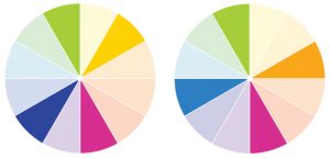
Complementary colour scheme
This one is all about contrast,
Triad Colour scheme
Generally, one of the three colors is the dominant note and the other two act in a supporting role. This sort of color scheme has a casual, natural feel,
Complementary colour scheme
color schemes are those where four main colors are used
here is a list of what colours can do in a scene or for advertising material.
Red
Pops things
Orange
Cheerful simple and uncomplicated
Yellow
Stands out in any environment visually aggressive
Green
Is the colour of trees grass for it is relaxing and neutralising. Green also represents jealousy, weakness and immaturity.
Blue
The Colour of the sea, and sky it’s a cool colour
Purple
Purple is artificial and symbolises authority respect and dignity
Brown
This reminds us of nature and sadness and wistful dry leave tan light brown
White
Symbolises purity innocence peace, is associated with winter hospitals objects etc.
Black
Symbolises evil and mournfulness
Emotional aspects of colour
Below is a list of colours and combinations of what has been used over the years in film, Marketing / Advertising, Theatre.
Using subtractive and additive colour systems for lighting and in film production and colour correction and grading we can come up with some emotional looks for the audience.
Warm
Magazines and posters contain warm colours to grab our attention.
“ “States Warm colours are bright, splashy, aggressive and attractive. They excite our emotions and enhance our motivation
Cool
Cool shades of blue and green look clean and inviting.
Remind us of snow and ice
Light
Assists in mood and relaxation
Used in interior design
Dark
Represent day and night
“states “Dark colours make the surroundings appear smaller and create a feeling of seriousness. Light and dark are most common combinations and represent opposite natures, such as day and night.
Vivid
Bright colours are attractive, cheerful, and quickly come to our attention. They are ideal for packaging, fashion and advertising.
Dull
As soothing colours, they are mostly used for interior decoration.
Dull colours help to reduce tension and give colour schemes a meditative, dreamlike mood
Striking colour Schemes
The easiest way to make a striking colour scheme is to choose red as one component. A striking colour scheme should contrast light colours with dark colours.
Tranquil colour Schemes
Cool colours such as blue and green are used for avoiding strong contrast.
A tranquil colour scheme works best in a natural setting.
Exciting colour Schemes
Like a striking colour scheme, an exciting colour scheme makes use of bright red and strong contrast.
Natural colour Schemes
Natural colours are subtle and complicated hues, mostly dark and muted, never colourful. Natural colours are complex combinations of many hues.
Surprising colour Schemes
(Magenta, yellow and cyan) will tend to seem startling and unconventional.
Rich colour Schemes
Richness is achieved by combining a powerful hue with its darkened complements.
Romantic
Pink is used in association with romance you can make romantic colour combinations tins and shade s of pink violet and peach.
Soft colour Schemes
calm, cheerful and inviting. More use in home decorations
Elegant colour Schemes
creamy tones covey a sense of classic and elegant and reminds of silk and linen.
Red and orange Combinations
Various colour schemes with red are used for advertising displays or for symbols of strongest emotions. Vermilion, red-orange hues create a feeling of vitality and vigour.
Orange combinations convey friendliness.
Combinations with Yellow
Colour combinations with yellow and orange are welcoming.
Combinations with Green
A bright green blue, is the warmest of the cool colours and is considered as a tropical colour. Light tints of the blue-green family convey the feeling of tranquillity and relaxation.
Combinations with Blue
Greyed or lighted tints of blue produce restful and calming effect
States “Deep navy as the uniform of personnel such as the police, navy, and pilots ensure authority and reliability.
Combinations with Violet
Violet is associated with surprise and magic.
Combinations with Black
These neutral colours lack personal characteristics and are liked by professional people.
References
Cook, B. (n.d.). The art of short form content. O’Reilly Online Learning. Retrieved November 18, 2022, from https://learning.oreilly.com/library/view/the-art-of/9781317329954/
Woodhead Publishing. (n.d.). Colour design. O’Reilly Online Learning. Retrieved November 17, 2022, from https://learning.oreilly.com/library/view/colour-design/9781845699727/
Peachpit Press. (n.d.). Color correction look book: Creative grading techniques for film and video. O’Reilly Online Learning. Retrieved November 17, 2022, from https://learning.oreilly.com/library/view/color-correction-look/9780133818482/
Stump, D. (n.d.). Digital Cinematography. O’Reilly Online Learning. Retrieved November 14, 2022, from https://www.oreilly.com/library/view/digital-cinematography/9780240817910/